
Kami Solutions
-
Posts
84 -
Joined
-
Last visited
-
Days Won
1
Recent Profile Visitors
3,366,195 profile views


Kami Solutions's Achievements
")


-
Search_widget / Search bar modification on top menu
Kami Solutions replied to Max's topic in General topics
Hi, sorry for late reply, just needed to check on this info and @terebesirobert is right, just look at the id you want to put inside the setFocus() function, you are pointing to a class and not to a id, so in order to work you should set <div class="search-widget__group"> <input id="my_id_function" class="form-control search-widget__input-right" type="text" name="s" value="{$search_string}" placeholder="{l s='Search our catalog' d='Shop.Theme.Catalog'}" aria-label="{l s='Search' d='Shop.Theme.Catalog'}"> <button type="submit" class="search-widget__btn btn btn-link" onmouseover="setFocus()"> <i class="material-icons search"></i> <span class="d-none">{l s='Search' d='Shop.Theme.Catalog'}</span> </button> </div> Where "my_id_function" should be replaced to any name you like, leaving your script code: function setFocus() { document.getElementById("input.form-control.search-widget__input-right").focus(); } Be sure to modify this .tpl inside your theme/modules/ps_searchbar.tpl file and not in your modules folder, since the updates will overwrite it.- 17 replies
-
- 1
-

-
- search bar 1.7
- minimalist search bar
- (and 1 more)
-
Not working shopping cart after Upgrade 1.7.8.0
Kami Solutions replied to MuniGod's topic in Bug reports
Works like a charm, what a legend! This works on PS 1.7.8.7 with the core.js provided by @dimtsef (Path to change this file is /themes/core.js) Remember to clean cache on boths sides -
redirect after login - Prestashop 1.7
Kami Solutions replied to dellwen!!@@'s topic in 1.7.2.x [Current]
Thank you for the module, very elegant way to solve things in PrestaShop. Sad to see that a simply redirection of 1 line of code in the core would need so many lines in order to fix it😂 Works like a charm for PS 1.7.8.7 -
Go to ps_shoppingcart.js file inside your modules/ps_shoppingcart module directory (I would hardly advise to do it in your theme folder, theme/modules/ps_shoppingcart/ps_shoppingcart.js) and go to line if (resp.modal) { showModal(resp.modal); } Where you want to change it to: if (resp.modal) { window.location.replace(prestashop.urls.pages.cart+'?action=show'); } This will solve the issue when the customer is logged in or not (guest and customer). Remember to clear the cache in var/cache by deleting the cache folder, otherwise your changes might be unaffected.
-
Not working shopping cart after Upgrade 1.7.8.0
Kami Solutions replied to MuniGod's topic in Bug reports
Thank you, seems that changing back to previous core.js works! -
Not working shopping cart after Upgrade 1.7.8.0
Kami Solutions replied to MuniGod's topic in Bug reports
Would be very usesul if he share's the fix so we can get out of this issue... I've also faced same issue and going back to classic theme solves the error but not with child theme created from 1.7.7... Can you ask him if he chan share the fix here? Thanks -
Prestashop 1.7 visible or not visible on mobile device
Kami Solutions replied to Ornot's topic in Core developers
Hello, the classes above won't work on prestashop, these will do the trick: .hidden-[size]-[behaviour] Where [size] can be "sm" , "md" , "lg" , "xl" As you can see is very intuitive and you hide it depending on your needs, being "sm" (small) for mobile, "md" (medium) for tablet, "lg" (large) on desktop and "xl" (extra large) for larger displays. Where [behaviour] can be "up" or "down", if you want to be shown should be "up" and hidden with "down". This way you can show things only for mobile, for example : .hidden-sm-up I know it's an old post but for everyone who is looking for this info should be helpful -
Hello everyone, I'm following this readme in order to get Vue.JS in development mode since I'm having issues in the stocks page (loads way too slow +50s) https://github.com/PrestaShop/PrestaShop/tree/1.7.7.x/admin-dev/themes/new-theme/js/app But when I do npm install It gives me a lot of warnings, the first one is that there is no package.json, so how do I put Vue.JS in my fresh installed prestashop under dev-mode??? npm WARN saveError ENOENT: no such file or directory, open '/admin/themes/new-theme/package.json' Thanks
-
No, I just stopped the development because I don't have time but it's on my TO-DO list
-
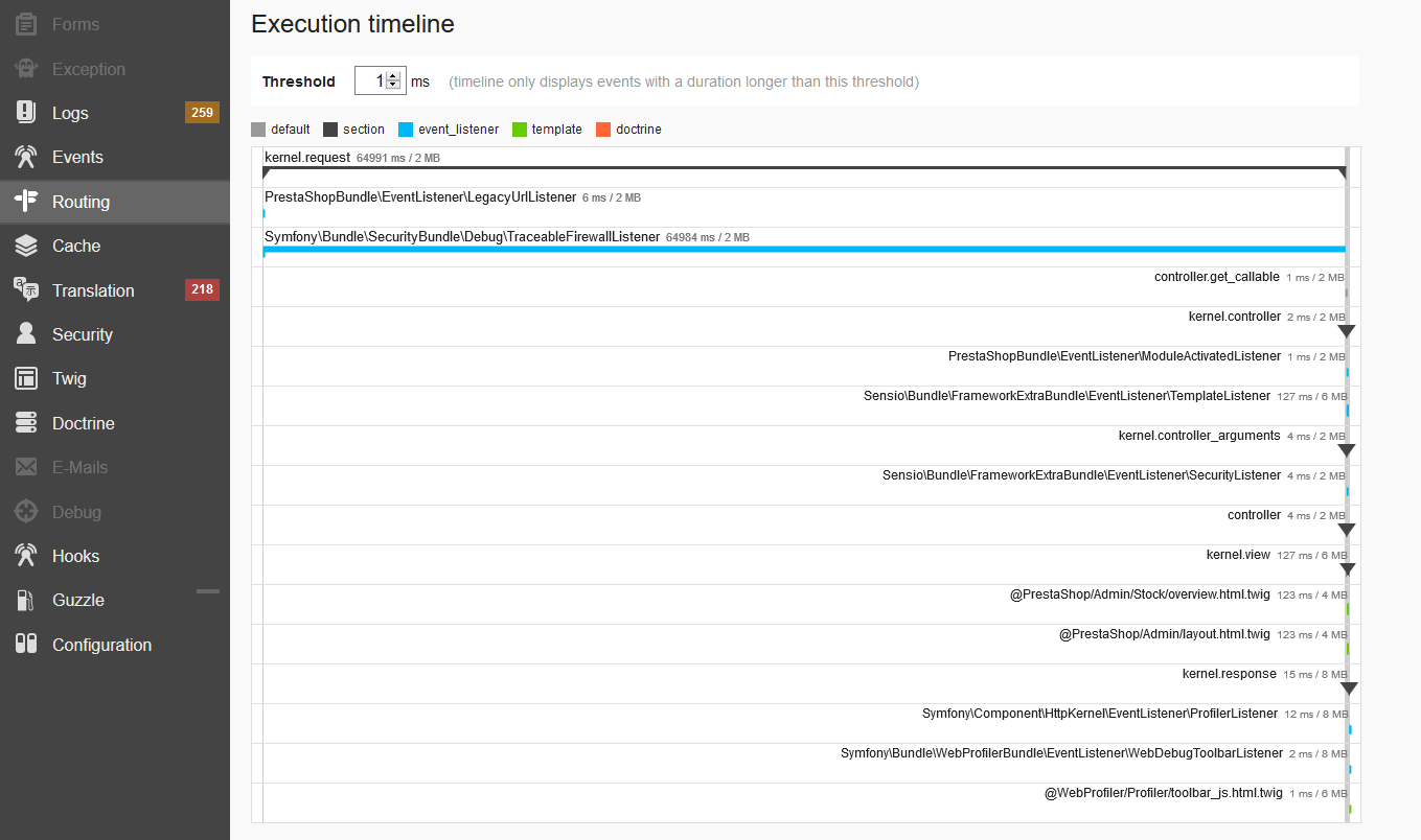
Hi, I've been looking at how to use symfony without any success since I'm having issues in the backoffice, especially with stocks page that loads way too slow, it takes up to whole 65seconds to load! Just one page! The other pages takes also a lot of time, but when I check symfony debugger there are no errors, just a bunch of missing translations, might this be the cause of the lack of speed? I have two exactly shops (because I cloned them) with same version 1.7.6.1 at the same server, and one is loading good and the other one is extremely slow, how can I debug this issue? Thanks in advance

-
Muchas gracias!
-
Hola, Podrías explicar o poner un fragmento de cómo realizas el update del pedido por webservice? Gracias
-
Yo miraría algo del servidor si está bloqueando IP's de google, o que directamente el servidor esté bloqueando crawlers de google, que tiene toda la pinta. Otra cosa que se me podría ocurrir es que tuvieras muchísimas páginas y páginas anidadas una dentro de otra haciendo el script de google eterno y por eso te tira un error 500, habría que ver más datos
-
Puedes hacer una exportación en CSV de los productos y combinaciones y subirlo directamente, aunque realmente no te lo recomiendo, ya que es algo bastante tedioso en prestashop. Lo que yo suelo hacer es usar un módulo de pago, el mejor que he encontrado y funciona sin problemas es éste: https://addons.prestashop.com/es/migracion-copias-de-seguridad/8934-actualizacion-de-prestashop-y-herramienta-de-migracion.html La ventaja de éste módulo es que puedes migrar los datos de una tienda vieja a otra totalmente nueva, por lo que la tienda seguiría funcionando perfectamente y sin cortes, si es en el mismo dominio lo puedes crear en una subcarpeta y cuando esté todo listo para producción cambiar el nombre de la carpeta en la base de datos. Si te urge, cómpralo que te vas a ahorrar muchas horas de trabajo manual y que encima puede acarrear errores.
-
La carpeta app está en la raíz de tu instalación de prestashop, que normalmente si estás en un hosting será del palo public_html/app ó public_html/carpeta_prestashop/app