
mjfaulkner
-
Posts
2 -
Joined
-
Last visited
mjfaulkner's Achievements
")
Newbie (1/14)
0
Reputation
-
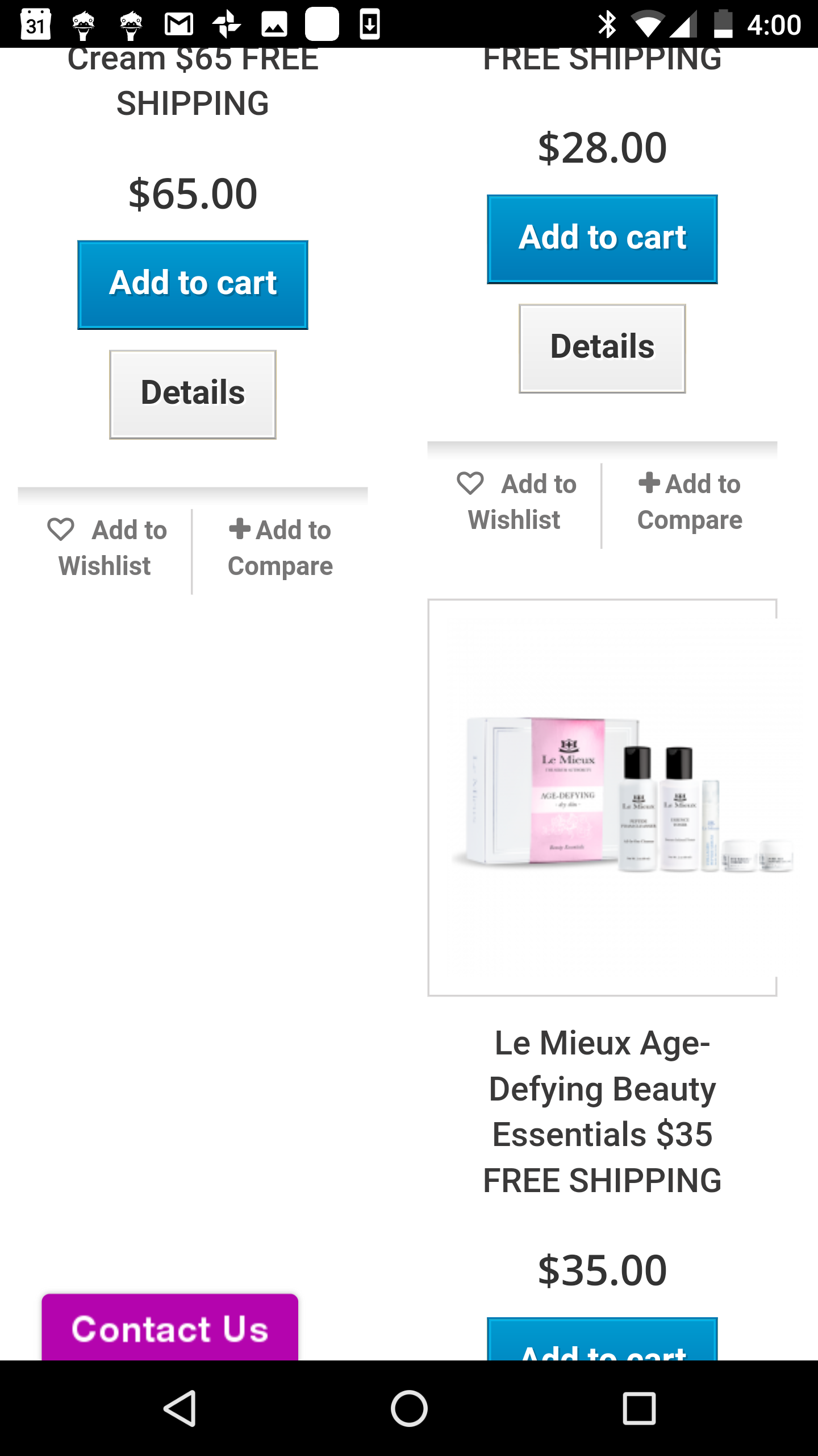
I'm having the same issue outlined in this thread (unfortunately couldn't reply to it or get a working solution from there) https://www.prestashop.com/forums/topic/370354-2-product-columns-for-mobile/ That is, I'm trying to display products per row when viewing on a mobile and changed the product-list.tpl from col-xs-12 to col-xs-6 to achieve this. Unfortunately, when viewing on a mobile, some lines will only display one product instead of 2, leaving an ugly looking gap. The problem seems to only happen when on rows below where the product on the left has a longer description or is an extra line longer than the one on the right. Problem only occurs on mobile phone (Nexus 6P), it's fine on tablet. Problem can be recreated on desktop by squeezing browser window to narrowest setting. Greatly appreciate any solutions or workarounds anyone has. I'm using Prestashop 1.6.0.8 Default Bootstrap theme and webpage with issue is below: http://simplysmoothskincare.com/store/45-le-mieux-skincare

-
i don't have a solution but I have a similar problem appearing from the front office noticed during testing (I visit my own site a lot!). When returning to the site after a few days while having been logged in, a different customers name and address would appear in the shipping information (i also had the ability to change it in the user account). Also if returning to an abandoned cart whilst not logged in, the site had prepopulated a different customers guest checkout information (name and address). Logging out and logging in solves if signed in and the guest checkout issue would be removed if logging in with a proper account. The problem does not appear to exist to a user visiting the site for the first time. It would however, be quite disconcerting and a security concern for a customer to see someone elses name and address upon returning to the site. I think the original posters diagnosis of the mis-assignment of ID# is correct. In my instance, the issue might have something to do with having deleted several customers in the back office and their Id's being reassigned. I would also appreciate a solution or better understanding of the problem, though realise it's a tough error to replicate.