
AndreasBN
-
Posts
10 -
Joined
-
Last visited
AndreasBN's Achievements
")
Newbie (1/14)
0
Reputation
-
Product grid page not responsive on tablet
AndreasBN replied to AndreasBN's topic in Configuring and using PrestaShop
Are there others who might know the problem? -
Product grid page not responsive on tablet
AndreasBN replied to AndreasBN's topic in Configuring and using PrestaShop
I have tried disabling the layered navigation, and the problem still occurs. Then i tried re-enabled the layered navigation, tried disabling the tag block and sales block, and the problem is still there. -
Product grid page not responsive on tablet
AndreasBN replied to AndreasBN's topic in Configuring and using PrestaShop
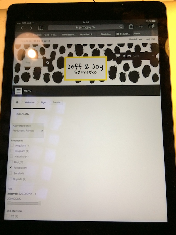
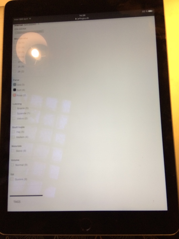
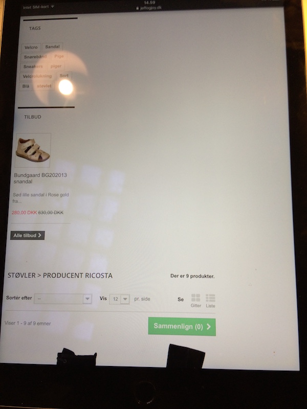
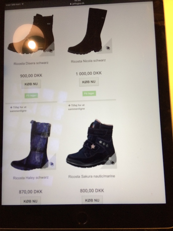
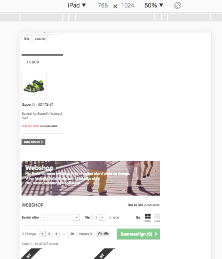
This is how it looks like on an iPad bought less than 1 year ago: - edit: Resized pictures
-
Thanks!
-
Product grid page not responsive on tablet
AndreasBN replied to AndreasBN's topic in Configuring and using PrestaShop
Adding some info: It is v. 1.6.1.6, and the theme is customised default theme from PS Theme Maker. -
It's v. 1.6.1.6, and the theme is customised default theme from PS Theme Maker.
-
Hi In the product list/grid, how do I remove the top next/previous, page numbers, compare, and show all buttons, and only keep them in the bottom of the list? Best regards Andreas
-
Product grid page not responsive on tablet
AndreasBN replied to AndreasBN's topic in Configuring and using PrestaShop
No one? -
Hi I have a question regarding the responsiveness of my product grid page. On PC and mobile it looks perfectly fine, but on tablet the product grid is positioned beneath the "Block layered navigation" module, without the module being responsive. See example: www.jeffogjoy.dk/3-piger I have tried to enable and disable mobile theme on tablets in theme settings, without any difference. Can anyone help with making the page responsive? And it doesn't matter if it goes into mobile view or not when using tablet, just the easiest solution is appreciated. Sincerely Andreas
-
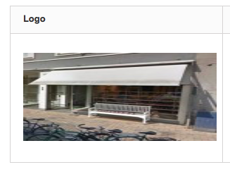
Hi I have tried uploading a picture of our physical store front, but the picture gets out of proportion when I see it in the frontend. I've uploaded a picture for reference: The picture should have been 300 x 300 px. Does anyone know which proportions to use?