
Luchano
-
Posts
4 -
Joined
-
Last visited
Luchano's Achievements
")
Newbie (1/14)
0
Reputation
-
Searchbox and Cart on the same row - Responsive
Luchano replied to Luchano's topic in Addons, modules and themes developers
Brilliant! The proposed solution did the job perfectly Just for learning purposes, what we did here was to add the col-xs-6 in both .tpl files, where "xs" defines the columns just for mobile view and "6" puts the two modules in two equal columns. Is that correct? Thank you rocky for the immense help! LG -
Searchbox and Cart on the same row - Responsive
Luchano replied to Luchano's topic in Addons, modules and themes developers
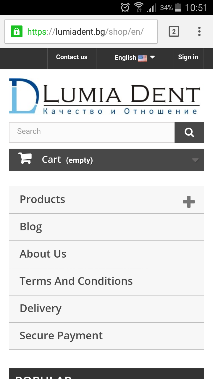
Hello rocky, Thanks for replying! The url is the following: https://www.lumiadent.bg/shop/en I have reverted the original code for the searchbox and the cart to be 100% width. From my basic understanding, the webpage is split into three columns. The logo image is placed in the left column, the searchbox is placed in the center column and the cart is placed in the right column. When the browser window is shrunk to 480px these columns get placed under one another. Is it possible to display two of these columns next to each other when the website is loaded onto a mobile device? Thanks a bunch! LG -
Hello Prestashop community, I have one problem to solve today and I hope you can help me out with it!! You can see on the screenshot below that I have reduced the search box field and the cart box so that they can fit on the same line, but it does not happen automatically. Can someone give me the solution for achieving this? Many thanks for everyones help!! LG

-
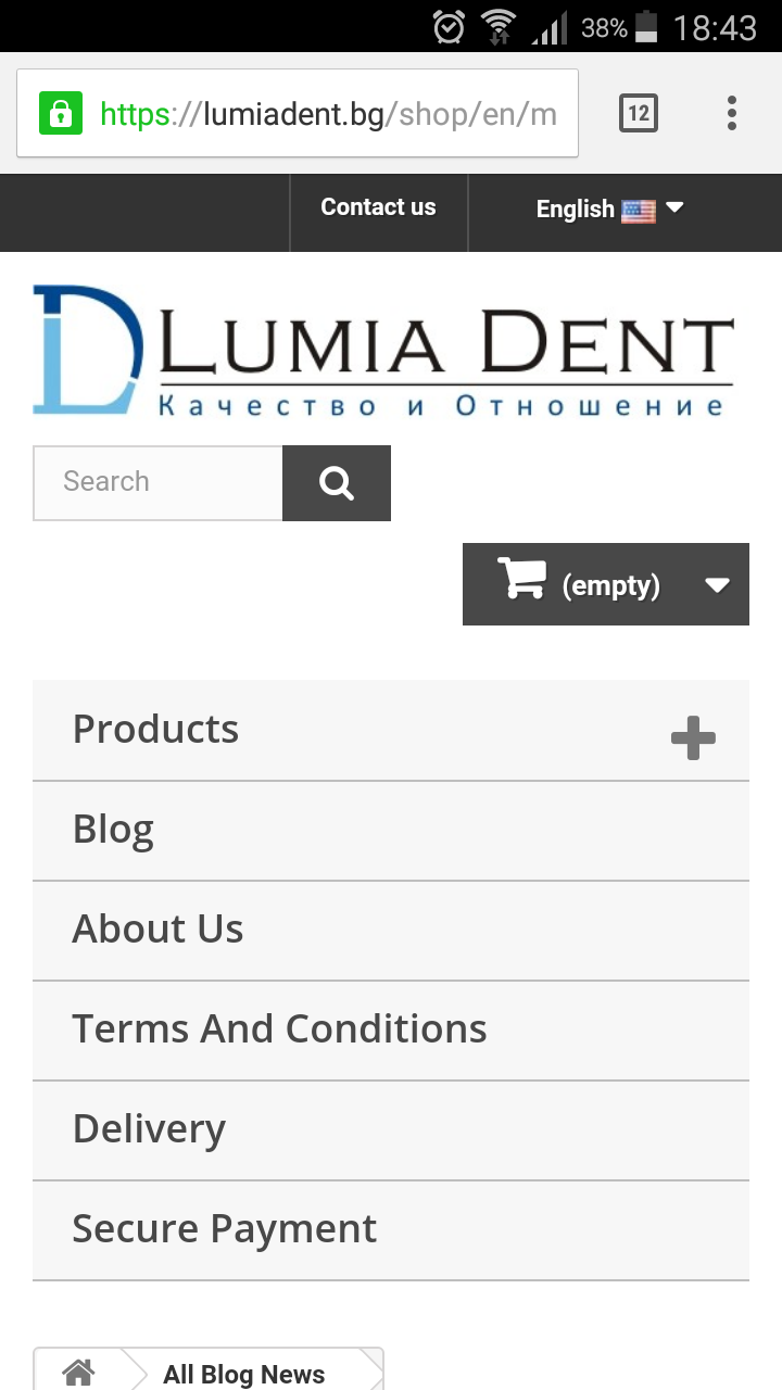
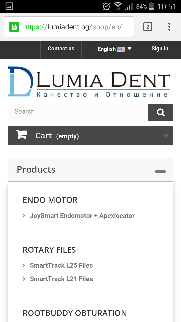
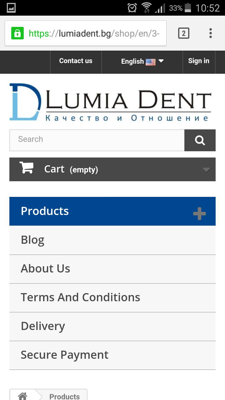
Hello PrestaShop community, I have set out to modify my mobile website version of the default-bootstrap theme. What I am trying to do today is to change the action that occurs upon tapping on the "Product" sub-category in block_top_menu. Please refer to the screenshots below for more clarity: 1. This is how my website menu of sub-categories looks like: 2. When you tap on the plus (+) sign next to Products the dropdown menu expands like that: 3. However, if you tap anywhere else not on the plus (+) sign then the the Products page executes the href command and loads the product page: I want to modify the dropdown menu so that wherever you tap on that Product bar the dropdown menu will expand. I will really appreciate all advice and suggestions on how to produce this effect! Thank you in advance. Kind regards, Luchy