
Mrs.Blak
-
Posts
5 -
Joined
-
Last visited
Mrs.Blak's Achievements
")
Newbie (1/14)
0
Reputation
-
 Hello, I'm using Prestashop 1.5 with a custom responsive theme which has mobile version. I would like to know how can I disable layered navigation block from mobile version without disable it from the main theme. Any idea where I have to start to looking for? I have been looking in FrontController.php within classes/controller but I'm no able to figure out how can I do it. Any response is welcome. Thank folks Mrs.Blak
 -
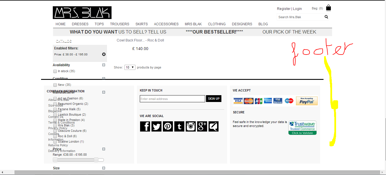
Hi Vekia. Thank again. I don't understand very well what you mean. Following your steps I have created a class in global.css .mparam{margin-top:585px;} /* ************************************************************************************************ FOOTER ************************************************************************************************ */ #footer { width: 980px; margin: 0 auto; height: 120px; padding-top: 20px; padding-left: 10px; color:#000; background:#fff; font-size: 11px; border-top-width: 3px; border-top-style: solid; border-top-color: #000; } .mparam{margin-top:585px;} #footer a {color:#666!important;} #footer a:hover {color:#333333;} I assigned it at <div id="footer" class="mparam"> in footer.tpl. <div class="grid_10 alpha omega clearfix"> <div id="footer" class="mparam"> But it isn't working.
-
Thank you. It looked like easy when you gave me the solution. I did it and the central column took the right position. But now I have to stop it so that the left column does not reach the footer. Do you know what I have to do for that? Do I have to change any parameter in javascript files? Regards!!

-
Hello guys. I'm trying to fix the position of the left column with the aim that when you scroll down, the left column does not disappear as I show you in the following image. This is code of the header.tpl where I added the left column. <div id="page" class="container_9 clearfix"> <div id="columns" class="grid_9 clearfix"> <!--alpha omega --> <!-- Left Column. I added this code Limones --> <div id="left_column" class="column grid_2" > <!-- omega --> {$HOOK_LEFT_COLUMN} </div> <!--grid-7 break up the center column in 7 grids.Antonio --> <div id="center_column" class=" grid_7 alpha omega "> I've added the following code css to the div left column tag <div id="left_column" style="position:fixed"; class="column grid_2" > <!-- omega --> {$HOOK_LEFT_COLUMN} </div> <!--grid-7 break up the center column in 7 grids.Antonio --> <div id="center_column" class=" grid_7 alpha omega "> and the result is this. Does anyone have any idea how can I fix the position of the left column without that the central column is placed over the left column? Thanx.
-
Hello guys. I have moved prestashop 1.5.x from one web server alive to localhost on wamp. I have followed all the steps I found surfing the web. After installed it I can get access to the home page, but when I try to move on to other pages I get the error 404. Page not available We're sorry, but the Web address you entered is no longer available To find a product, please type its name in the field below Any idea? Thnx. It was a problem of .htaccess. But I couldn't regenerate it from Preferences>>SEO URLs Friendly URL in the main menu such I had read in prestashop's forums since my server wasn't in rewrite_module. So I went to wampserver>>apache>>apache module>>rewrite_module and I selected the option rewrite_module. The .htaccess file was regenerated. Regards.